Are you a food photographer or restaurant owner? Here are some secrets used by professional food photographers to make your photos look more appetizing ? all done inside Lightroom. You?ll learn how to give your food a light glow, improve the colors, and more!
Before and After


Step 1
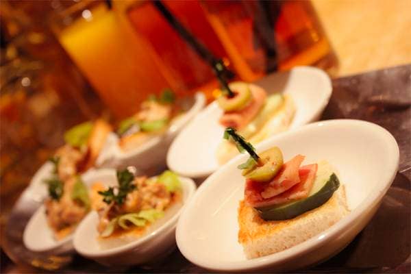
Start off by opening a food photo into Lightroom and going into the Develop module. Here?s the photo that we?ll be using ? it?s already edited pretty well. This Lightroom tutorial isn?t intended to teach you the initial parts of photo retouching so you?ll have to work on a retouched photo first. What this tutorial will show is a few techniques you can use to make your food look more delicious.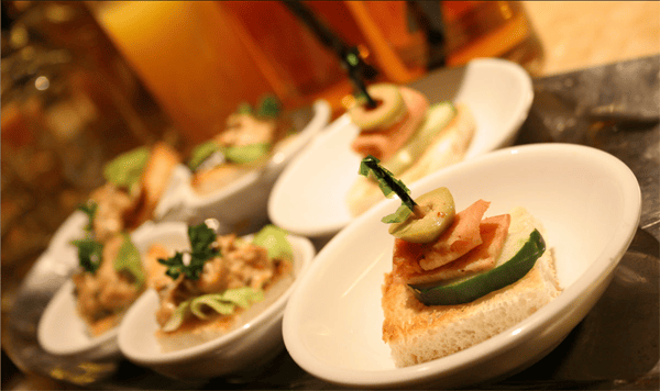
Step 2
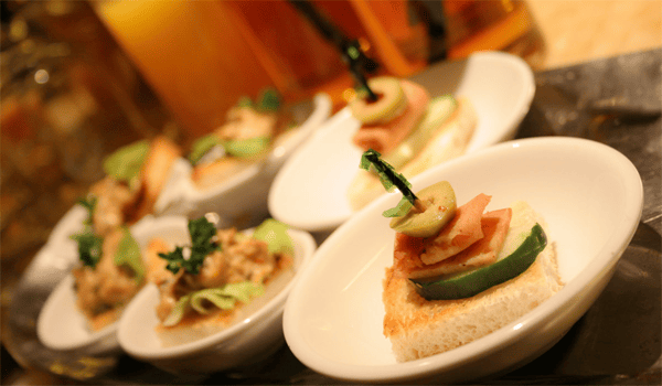
The first setting we always try out for food photos is the clarity setting. It?s a great setting for improving skin tones but it?s also great for improving the tone of food! Start by reducing it slightly ? if you reduce it too much it?ll have a fake dreamy look which looks obviously edited. It?s best to keep the edits subtle so people do not immediately think that it was manipulated.

Here?s the image with the clarity reduced. It?s a subtle difference that gives the food a glow that makes it look more perfect!
Step 3
The next Lightroom tip for food photos is the color. Start by reducing the vibrance just until the white plates are white. Neutral dishware improves the focus on the food.

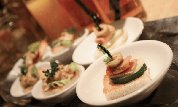
Next, increase the saturation to restore its original saturation.

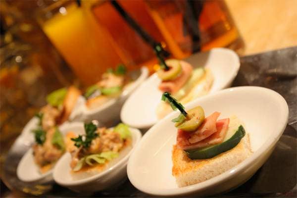
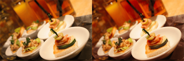
Here?s a before and after. The left image is before and the right image has the vibrance and saturation settings adjusted. Again, it?s another subtle retouch but it?s a great way of making white dishes look white.

Step 4
Here?s the final tip! Add some reds to the image. In color theory, the color red is supposed to improve appetite. That is why you?ll see the interior of some restaurants painted red ? it?s not accident. Did you know red makes people feel warmer and can sometimes even increase their heart rate?
Here?s a subtle way of adding more red to your food photo. In the Split Toning area, set the Hue of the shadows to 0 and increase the saturation slightly.
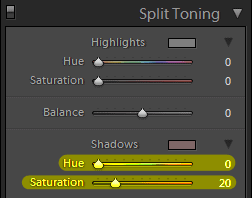
Only apply a tiny hint of red ? too much looks fake.
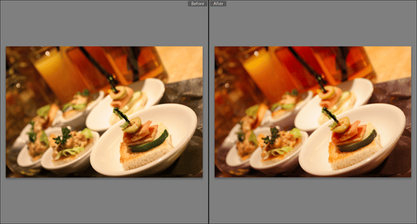
Here?s the before and after with the split toning. The image on the left is before and image on the right is after. It?s a very tiny change but it can help improve the colors ? especially in the shadows where it can appear greenish depending on the lighting.
Final Results
Here?s the final results! It?s a very slight change but a safe one for improving the colors of your food photos. When editing food photos, it?s important to keep the changes very slight and realistic ? so that people don?t immediately think that the photo was manipulated.
Important note for restaurant use: If you are using these photos for a restaurant menu, make sure you compensate the white balance for the lighting of your restaurant! For example, if your restaurant has warm lights, you may want to adjust the white balance of your photos so that it is cooler ? this way the whites in your photos will look white under the lighting of your restaurant. The key is to make the white dishes look white under your restaurants lighting conditions. Print out multiple versions of the same photo and compare them under your restaurants lighting.



Leave a Reply