What do you do with boring daylight photos? Here?s a color effect you can add in seconds with Lightroom! This Lightroom tutorial will show you how to do this with just a warm white balance, purple gradual filter, and a little split toning.
What you?ll be doing


Step 1
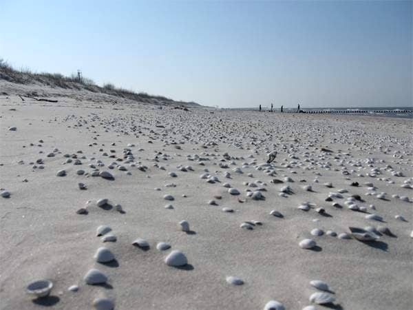
Here?s the image that we?ll be using. Just a regular blue-sky photo right now?
Step 2
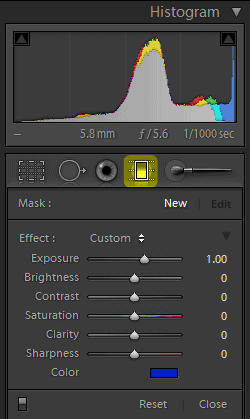
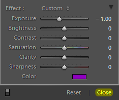
We?re going to start by adding a purple grad filter. In the Develop module, click on the Gradual Filter tool.
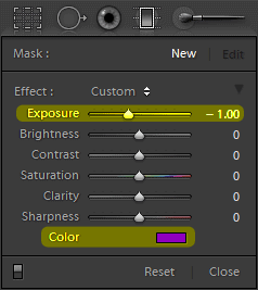
Set the Exposure to ?1.00 and color to any purple color you like.
Step 3
Click and drag from the top of your image down so that you get a gradual filter like this. The middle line should be near your horizon. Note that if you hold the shift-key while dragging, it?ll create a perfectly straight filter without any tilt.
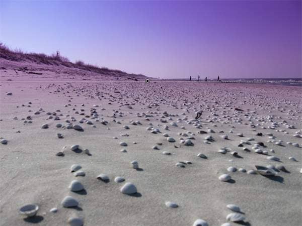
You can go back and change the settings if you like. Click on the Close button when done.
Step 4
In the Basic adjustments area, increase the Temp so that your image gets warmer.

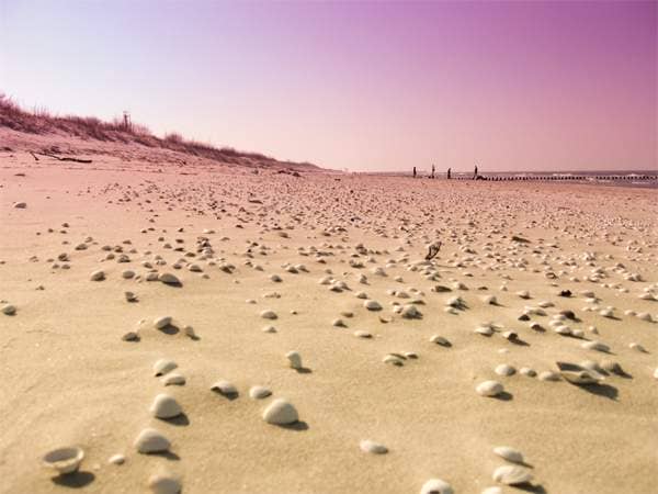
Here?s what the image looks like. Looks great so far? but we?re going to add a little split toning in the next step to make it even better!
Step 5
Go into the Split Toning area then click on the Highlights color.
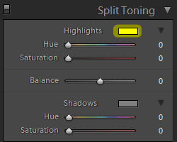
Select the second color from the preset colors.
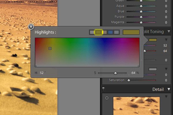
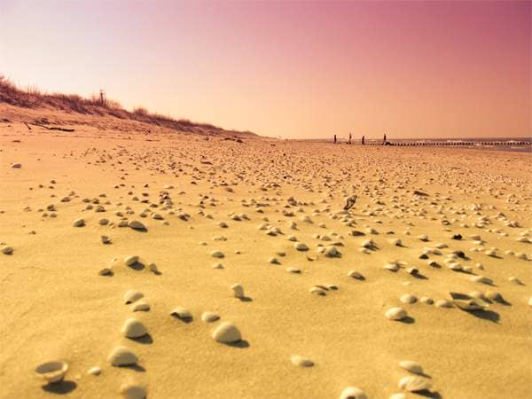
Here?s what the image looks like. The highlights are slightly warmer now.
Step 6
Click on the Shadows color.
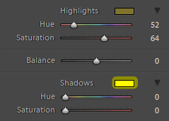
Select the fourth color from the color preset.
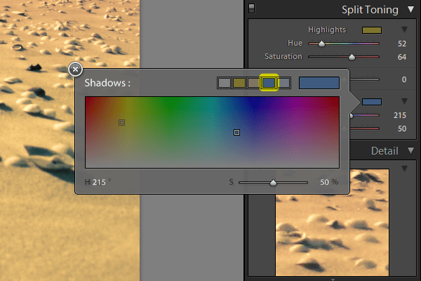
Here?s what the image looks like with split toning!

Final Results
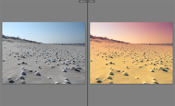
Here?s the final results! You can create a preset out of this but if you do, keep in mind that it may not work on every photo. Because of the purple gradual filter we used, it really only looks good if your photo has a horizon.








Leave a Reply to AdministratorCancel reply