Learn how to create a standard film look in Lightroom. This tutorial will show you the starting steps to recreate the colors and tones of common film presets. You won’t get the exact settings to use but you’ll learn the process. Why? Because it’s a skill that you can use to recreate many other film looks.
Our Starting Photo
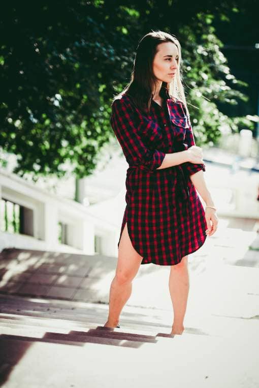
Here’s the photo that we’ll be using for this tutorial. You should use a photo that some greens and skin tones.

Step 1
In the Lightroom develop settings, scroll down to the HSL section. We’ll first adjust the colors of the palm leaves. You’ll notice that in a lot of film looks, foliage are less yellow and more desaturated blue-green.
Select the Hue targeted adjustment tool.
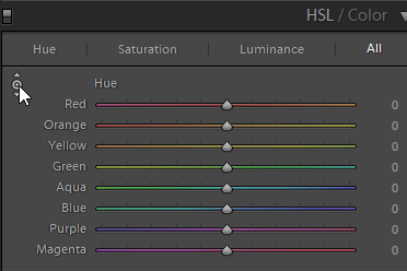
Select a foliage with some yellows in it and drag to shift the colors towards green. This will simplify the colors and make the plants look more healthy.

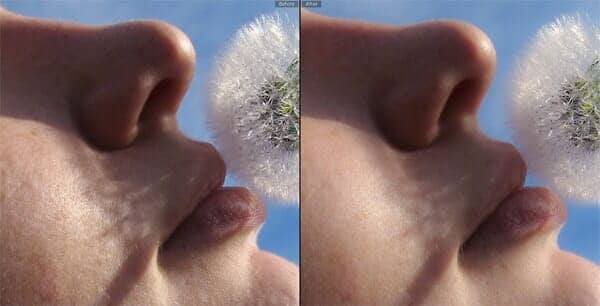
Here’s how it looks like before and after. As you can see, this simple hue shift makes a huge difference. This will shift skin tones slightly so double check to make sure that everything looks fine. If skin tones look unnatural, reduce the settings.

Step 2
Next, select the Saturation targeted adjustment tool and desaturate the greens.
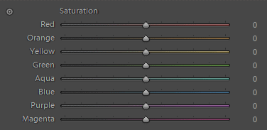
The leaves look less saturated and we’re getting close.

Step 3
Finally, select the Luminance targeted adjustment tool and darken the greens.

Here’s how our color grading looks so far.

Step 4
Next, we’re going to work on the skin tones using the same targeted adjustments. You likely don’t need to adjust the hue and lightness.

Step 5
Now let’s work on the tones. In the Tone Curve section, make sure you’re in the “Point Curve” mode. If you see the Highlights/Lights/Darks/Shadows settings in the image below, click on the button on the bottom-right corner.
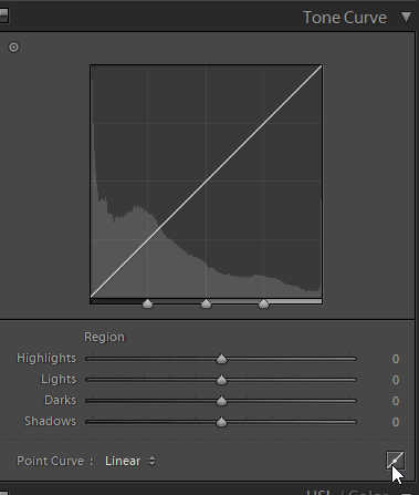
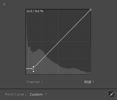
Once you’re in the Point Curve mode, drag the bottom-left point towards the right. This will crush the blacks – meaning that details in the dark area will be removed.


Next, drag the same point upwards to lift the blacks. This will make the blacks brighter for the faded film look.

Step 6
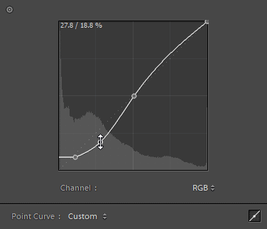
Notice how the image now looks low-contrast? To add some contrast, simply create an S-curve like this.

Step 7
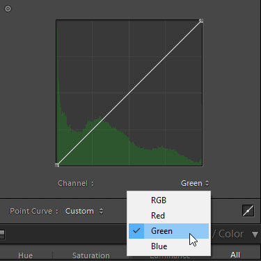
First, decide the color that you’d like to tint your shadows with. I’m going to pick green so I’ll switch to the green channel. If you like blue, switch to the blue channel.
Drag the bottom-left point upwards and you’ll notice that the shadows will have a green tint (blue if you selected the blue channel).
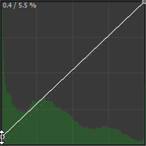

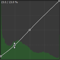
But notice how the green fades to the other colors a lot. This is the same results that you can get with the Split Toning adjustments. But because we’re using the tone curves, we can tell it to cut off the green tint by straightening the line like this.

That was just the basics. If you’re unfamiliar with the RGB tone curves, learn the tone chart technique. It’s the best way to understand how it works.

More Examples
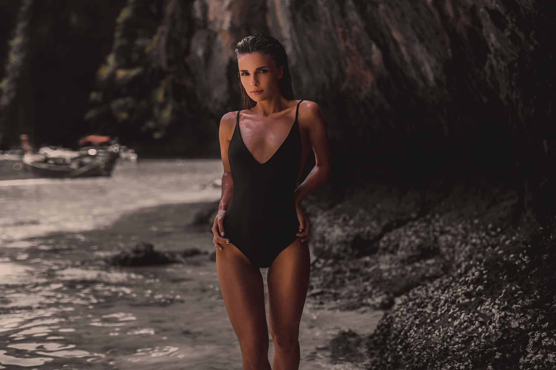
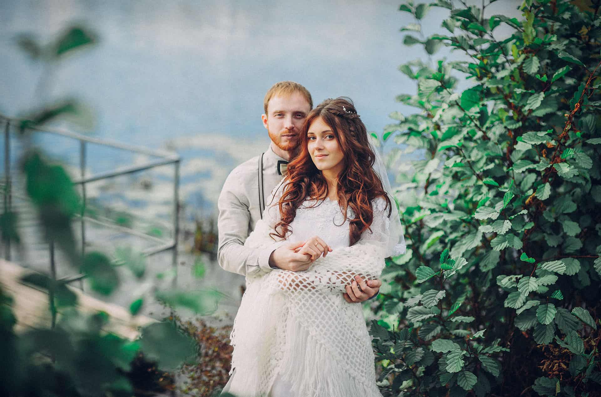
Here are some more examples. This is a quick and easy way to give your photos the film look. Remember these steps as a starting point and try changing things up to create different film looks!
Other settings to experiment with:
- Grain
- Highlights/Shadows
- Point Curve: Try dropping the top-right point and see what happens.





Leave a Reply