How to Achieve the Masashi Wakui Look

Masashi Wakui is popular for his captivating night photos of Japan. Wakui?s photos have this unique color effect that adds a touch of emotion to it. But what?s special is not the effect, but the technique used to create the effect. It involves just moving the existing nodes in the Tone Curve settings ? you don?t even need to add any nodes. This technique can be used to create a variety of faded effects.

What is the Masashi Wakui Look?

You can see from Masashi Wakui?s Flickr that his photos have a unique color effect that works very well with the busy night cityscapes he captures. He may or may not have invented the effect, or he could have used an existing preset, but we?re just referencing this effect under his name because that is where we found it. What?s important is not the name of the effect, but the effect itself. That is because the color grading was created from a simple and smart technique that can be used in different situations. In the steps below, we?ll guide you through the process of recreating the effect.

image

Step 1

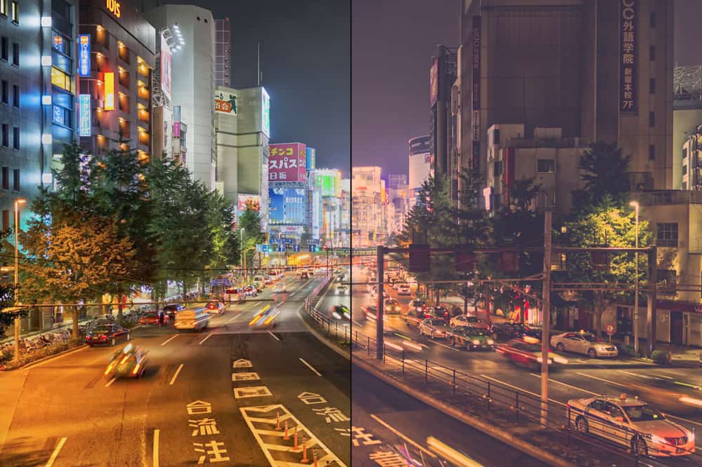
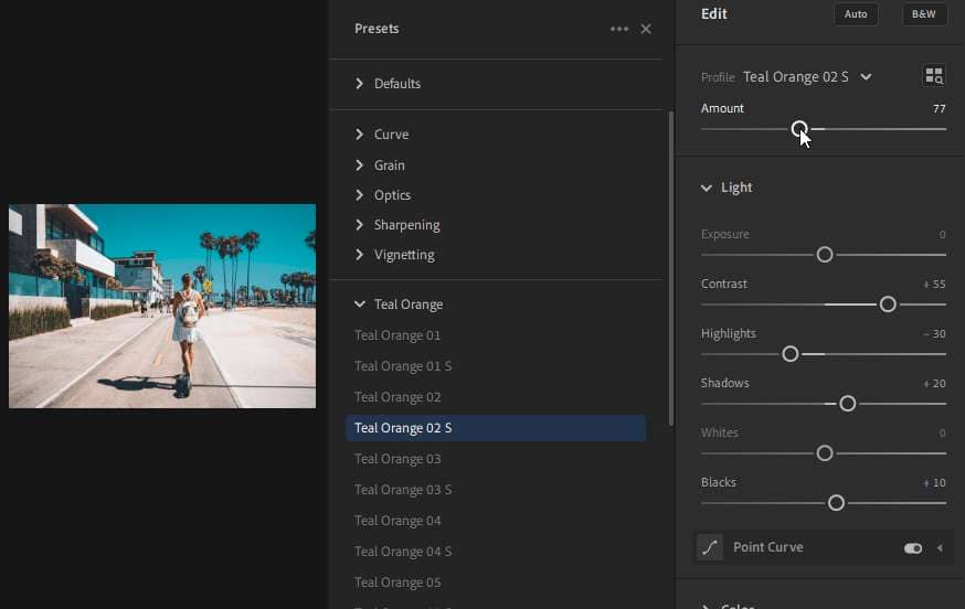
For this Lightroom tutorial, we?ll be using this photo of what looks like the Akihabara district in Tokyo. Go into the Develop settings and look in the Tone Curve area. We will only be using the Tone Curves for this tutorial.

image

If your Tone Curve shows the tonal sliders, click on the button on the bottom right of the Tone Curve section. This will switch it to point mode which allows for more control of the tone curve.

image

First, we?ll be lifting the blacks since that is the most obvious effect in Wakui?s photos. Simply drag the bottom-left node upwards like shown in the image below and you?ll get the lifted blacks.

image

Step 2

This is where the fun part happens. Click on the Channel dropdown and select the Green channel. Drag the top-right node downwards. This will compress the highlights in the green channel. The color grading doesn?t look very nice but it?ll all be fixed in the next step.

image

Step 3

Switch to the Blue channel then drag the top-right node downwards. How far down? About double the distance in the green channel.

image

Step 4

As you can see, we have an image with similar colors, but it?s not quite there. This is where you need to go back and forth between the RGB/Green/Blue channels and make adjustment until you get it looking right.

Tip: Moving the top-right node in the blue channel upwards increases the blue tint in the highlights. Moving it downwards increases the yellow tint.

image

You might even want to play around with the contrast or shadows/blacks to tweak the results a bit.

image

Final Results

That?s all! It?s a very simple technique that can be used in many different types of photos. This technique is quite special because it doesn?t require adding any nodes to the point curve. All you?re doing is crushing the shadows/highlights in the different channels.

image

Experiment with different settings. What happens when you lift the bottom-left node in the blue channel?

image

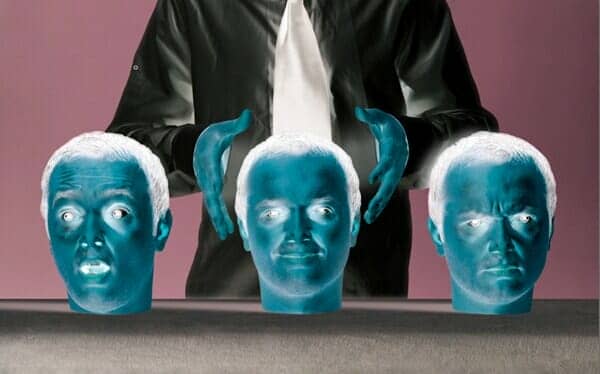
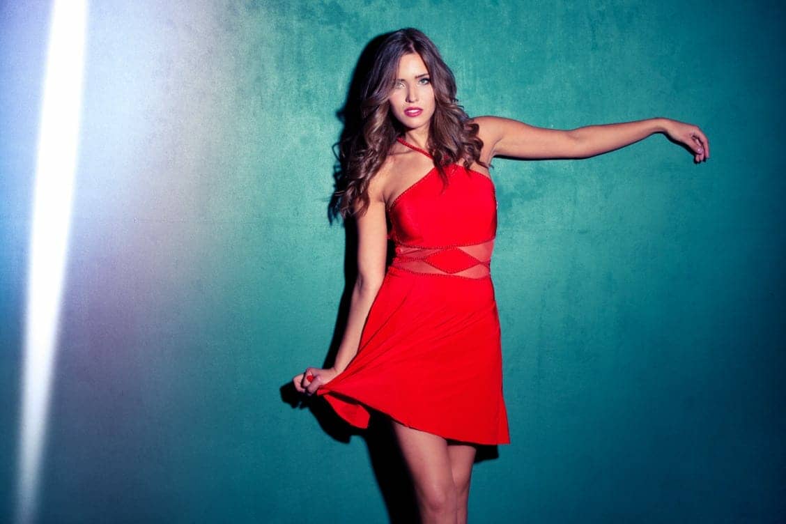
Here are more examples created with the same technique.

image
image

Update – March 3, 2016

This tutorial only covers a technique using the tone curve but does not go into further details on how to process it in Photoshop. For those who are wishing to achieve something closer, there’s a new set of Photoshop actions inspired by the post-processing style of Wakui. A free/lite version is also available on Photoshop Tutorials.

Comments

24 responses to “How to Achieve the Masashi Wakui Look”

  1.  Avatar
    Anonymous

    Can you do an update showing how to create photos similar to Wakui’s new work? He linked to this tutorial. However, the style of his new works is different.

  2. Carl C Avatar
    Carl C

    Don’t you think it is quite amazing what can actually be done with a photograph in lightroom? The more that I learn, the more I cannot believe it. Being able to know the post processing steps really makes me create different images within the camera.

  3. poop Avatar
    poop

    Wtf is up with the font on this website? It’s set to .5 opacity and it’s hard as hell to read, had to manually turn it off, really poor choice.

  4.  Avatar
    Anonymous

    This looks nothing like it. Lacking the gradient overlays. The answer is inside the free PS actions you linked to in the UPDATE section. Go have a look and update your tut please.

    1. lok Avatar
      lok

      Masashi linked to this tutorial on his Twitter. If it was wrong, he wouldn’t vouch this as the answer. Add some contrast + saturation and you will have the same style.

  5. yky Avatar
    yky

    Follow the thread, it is very easy to replicate his style

    https://fgts.jp/p/thread/2717546/#2717672

    1.  Avatar
      Anonymous

      link not working anymore

  6. Nath Avatar
    Nath

    Can’t find the “channel dropdown” option on my version of lightroom unfortunately. So I’m stuck at step 2 🙁

    1. Administrator Avatar
      Administrator

      What version of Lightroom are you using?

      1.  Avatar
        Anonymous

        i have same issue on 3.6.

        1.  Avatar
          Anonymous

          there’s your problem smh

  7. Jimmy Avatar
    Jimmy

    This guy has a similar style… maybe ask him
    https://500px.com/mtuni

  8.  Avatar
    Anonymous

    Guys he explained it on 4chan http://i.imgur.com/NJKE5K9.png

  9.  Avatar
    Anonymous

    Look likes he is using LUTS or some form of grading commonly used in video editing.

    1.  Avatar
      Anonymous

      He certainly isn’t using LUTs.

      I’ve seen people overanalyze this but it honestly is simple straight-line RGB curves. This tutorial works and Masashi Wakui linked to it on this Twitter.

  10.  Avatar
    Anonymous

    Missing steps on the HSL controls. Cheong has the right idea. Reverse the effect to get the normal photo then you will see the sort of HSL needed.

  11. Clint Avatar
    Clint

    It’s a fun tutorial but not quite there. Like it’s missing a couple of steps still. For instance, his blacks are staying black, but his bblues are becoming blue green and reds almost pink. And it’s almost like he has a bloom effect on his really bright areas of an image. The contrast is far more than yours and lastly, it feels sharper some how. I’m super glad you attempted however! It would be amazing if Masashi Wakui himself wrote a book on how to do the effect some day. I’d buy it!

    1. Trevor Avatar
      Trevor

      Yes, he blows the highlights as much as he can without making the neon signs unreadable while the shadow areas are very under exposed. He also uses vignetting a lot. There’s some teal/orange split toning also (teal shadows + orange highlights).

    2.  Avatar
      Anonymous

      This worked for me. The tutorial’s photos are bad examples but the curves are correct

  12. The Gimp Avatar
    The Gimp

    You’ve barely scratched the surface.

  13. linus Avatar
    linus

    Requires more tweaking but very close. Needs to be combined with dodge/burn and hue adjusting.

  14.  Avatar
    Anonymous

    exactly what I was looking for thanks !

  15. Cheong Avatar
    Cheong

    Interesting… if you do the opposite to the tone curve… moving the points left/right and not up/down, you can reverse the effect and see the non-filtered photo.

  16. Denis Avatar
    Denis

    Good tutorials but is not enough to recreate the Wakui style, he tell that use lightroom-photoshop then again lightroom, is hard to replicate.

Leave a Reply to AnonymousCancel reply